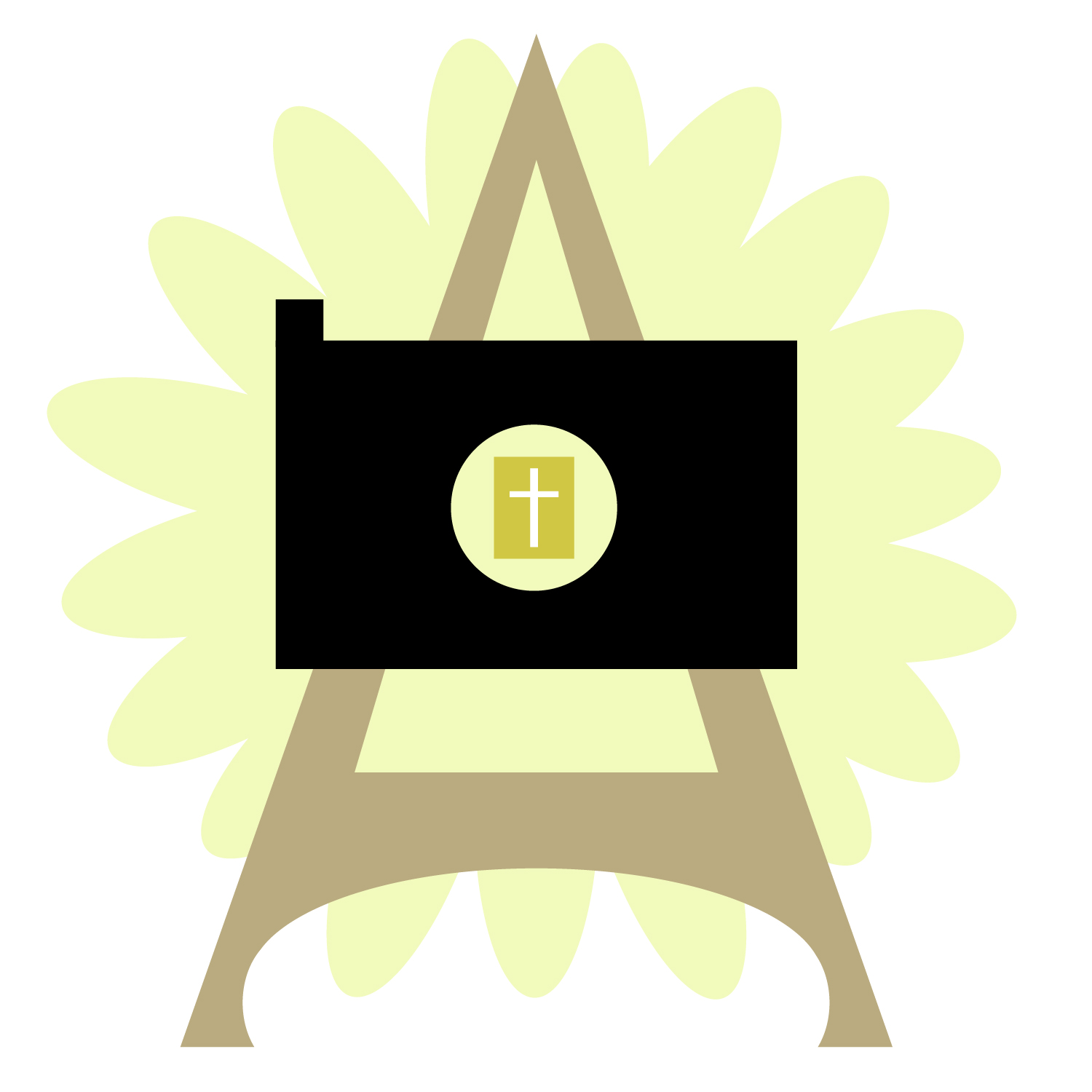
In my ARTS 222: Introduction to Graphic Design course at Liberty University Online, one of my projects was to make a logo for an event. I chose the imaginary event of a photography exhibition at the Eiffel Tower showcasing Bible verses that were designed on pictures of flowers. Therefore, I planned for the logo to show components of the Bible and Christianity, a flower, a camera, and the Eiffel Tower’s shape.
My professor gave me helpful feedback to edit my design. Therefore, I decreased the number of colors to 3 (besides black and white) and revised the design of the logo. This lesson and others that I have learned taught me the importance of having a focused, cohesive color palette.