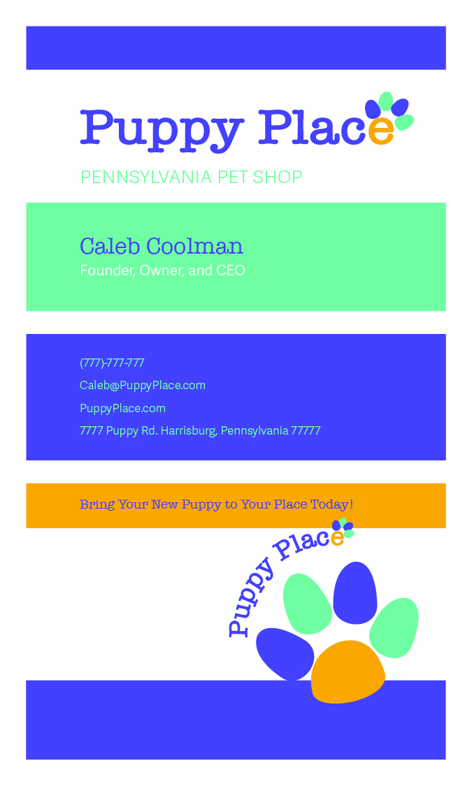
In my ARTS 223: Typography Lab 1 Fundamentals course at Liberty University Online, some of the parts of one of my projects was to make a business card’s front and back and a billboard. I chose a bright and colorful business card color scheme. I had to include certain types of information on the business card and billboard. I had to make a logo with a letter that could be made to look like an aspect pertaining to the business. I asked my brother for his help and advice, and he said that I should make a paw print with the “e” in “Place.” It was a great idea! I had two paw prints, one by the “P” in “Puppy,” and the other one as I described, made out of the “e” in “Place.” My professor said to just keep one, so I had just kept the “e” paw print for this version of the design. I am grateful for her help and feedback.
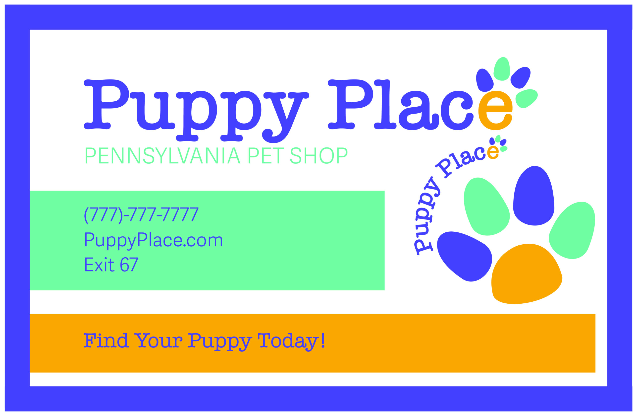
For the billboard, I had to include just a few words. I made the billboard to look similar to the business card. This is not the actual size of a billboard, but this design is smaller.